Structured data
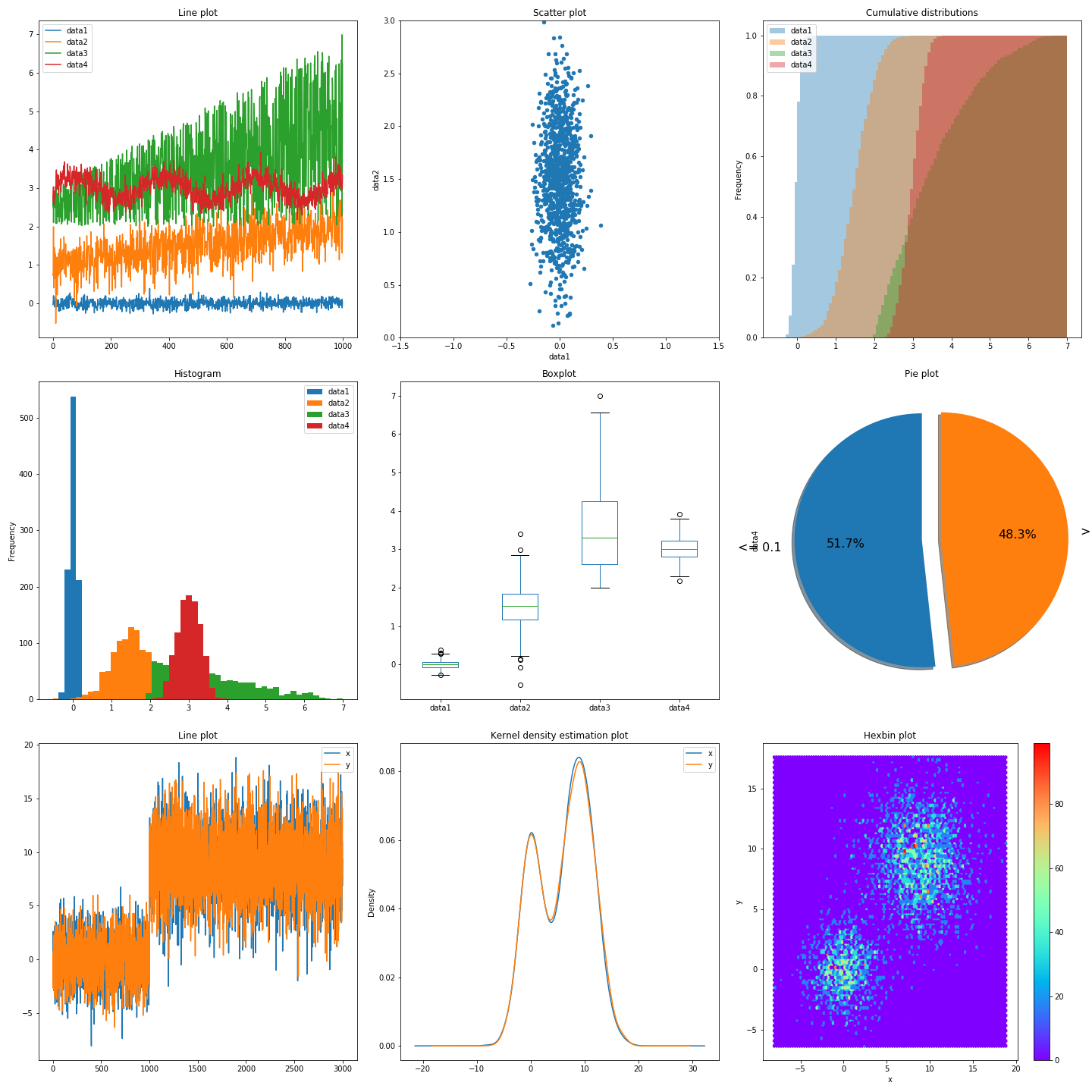
Visualizing data can help us get insights into it. Depending on the type of data you want to visualize, you may do so in different ways:
- For 1D data, like a temperature measurement or the number of hits on a webpage we use line plots
- For 2D data, like the weight and height of a person we use scatter plots
- To see the distribution of your data you can use histograms
- To see how much of our data falls into a certain category we can use cumulative plots or pie plots
- To see the spread of our data we can use box plots
- To see the estimated kernel(probability) density of our variables we can use kernel density estimation plots
- To represent the relationship between 2 numerical variables we can use a Hexbin plot
Unstructured data
Examples: images, sound, text
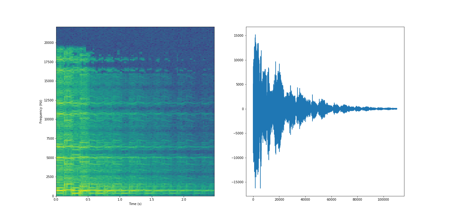
On the left we have a spectogram of the sound, created using a Fast Fourier Transform.
Image data visualization with Matplotlib
plt.figure(figsize=(16, 16))

from random import randint

rnd = randint(0, len(X_orig)-16)

j = 0
for i in range(rnd, rnd+16):
    img = np.array(X_orig.iloc[i])
    img = img.reshape(28,28)

    plt.subplot(4, 4, j+1)
    j=j+1
    s = 'L: ' +str(y_orig.iloc[i])
    plt.gca().set_title(s)
    plt.imshow(img)

plt.tight_layout()