Visualization can help debug CNN models. There are a couple of types of visualizations.
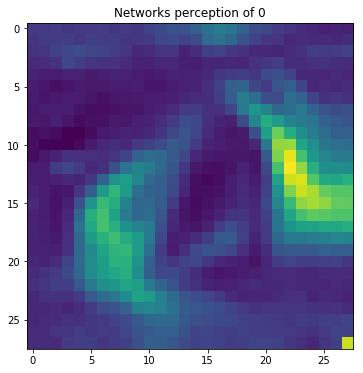
Activation Maximization1

In a CNN, each Conv layer has several learned template matching filters that maximize their output when a similar template pattern is found in the input image. First Conv layer is easy to interpret; simply visualize the weights as an image. To see what the Conv layer is doing, a simple option is to apply the filter over raw input pixels. Subsequent Conv filters operate over the outputs of previous Conv filters (which indicate the presence or absence of some templates), making them hard to interpret.
The idea behind activation maximization is simple in hindsight - Generate an input image that maximizes the filter output activations. i.e., we compute
$\frac{dActivationMaximizationLoss}{dInput}$
and use that estimate to update the input. ActivationMaximization loss simply outputs small values for large filter activations (we are minimizing losses during gradient descent iterations). This allows us to understand what sort of input patterns activate a particular filter. For example, there could be an eye filter that activates for the presence of eye within the input image.
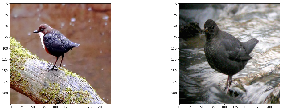
For the next 2 types of visualization we will use ImageNet and Ouzels as an example:

Saliency Maps3

Suppose that all the training images of bird class contains a tree with leaves. How do we know whether the CNN is using bird-related pixels, as opposed to some other features such as the tree or leaves in the image? This actually happens more often than you think and you should be especially suspicious if you have a small training set.
Saliency maps was first introduced in the paper: Deep Inside Convolutional Networks: Visualising Image Classification Models and Saliency Maps
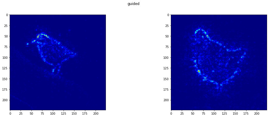
The idea is pretty simple. We compute the gradient of output category with respect to input image. This should tell us how output category value changes with respect to a small change in input image pixels. All the positive values in the gradients tell us that a small change to that pixel will increase the output value. Hence, visualizing these gradients, which are the same shape as the image should provide some intuition of attention.
The idea behind saliency is pretty simple in hindsight. We compute the gradient of output category with respect to input image.
$\frac{dOutput}{dInput}$
Class Activation Maps5

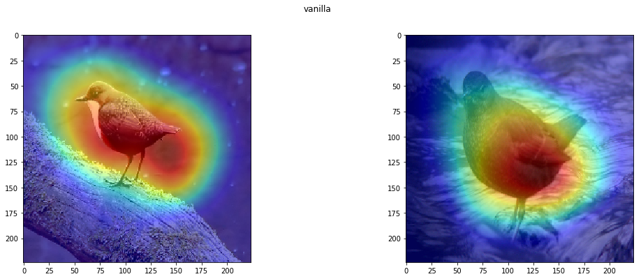
Class activation maps or grad-CAM is another way of visualizing attention over input. Instead of using gradients with respect to output (see saliency), grad-CAM uses penultimate (pre Dense layer) Conv layer output. The intuition is to use the nearest Conv layer to utilize spatial information that gets completely lost in Dense layers.
In keras-vis, we use grad-CAM as its considered more general than Class Activation maps.
This should tell us how the output value changes with respect to a small change in inputs. We can use these gradients to highlight input regions that cause the most change in the output. Intuitively this should highlight salient image regions that most contribute towards the output.
https://raghakot.github.io/keras-vis/visualizations/activation_maximization/
https://github.com/raghakot/keras-vis/blob/master/examples/mnist/activation_maximization.ipynb
https://raghakot.github.io/keras-vis/visualizations/saliency/
https://github.com/raghakot/keras-vis/blob/master/examples/resnet/attention.ipynb
https://raghakot.github.io/keras-vis/visualizations/class_activation_maps/
https://github.com/raghakot/keras-vis/blob/master/examples/resnet/attention.ipynb